Grade 7BB Digital Design Class:

Monday, April 18, 2016

Term 3 Scratch Programming Project:


Term 3 Scratch Programming Project:

Statement of Inquiry:
Computational Creation enables me to be creative.

Introduction:
In Term 3, we will be working on Scratch programming. This is creative computing and enables us to explore various Sprites and commands in Scratch.

Global Context:
ATL Skills:


Information Literacy:

I will be using my research skills and understand programming codes and controls using ''Scratch Program". I will be using Scratch help from the pull-down menu, as well as other videos on Scratch Programming to enable me to complete the program. The ''storyboard that'' website should enable me to create online storyboards for my design ideas.


Communication:

I have chosen Illiteracy and Lack of education as my topic to base a story on. I find that Illiteracy and Lack of education is a growing issue. I will present my Story in the presentation of a Scratch Story. 


Global Context:

This topic, Illiteracy and Lack of education is related to the Global Context; Fairness and Development.  

About Me - My First Project:

Here is my Scratch Programming Piece For Piece 1: 


Here is my coding:


Scratch Programming For Piece 1:
Scratch programming is basically a program made by MIoT (Massachusetts Institute of Technology) students, made to help others learn how to script and program anything to move or do a certain command. So, during IT class, we made our own scratch program. My first Scratch program try made my animation glitch. Thus, I made a new one, that made a ball bounce with sound effects. Furthermore, I learnt many things I didn't know, as this was my first time using this program. For example, I learnt how to script an object to do a certain function. I also learnt how to make my own animation, as well as character, and scenery. In conclusion, I found this "Scratch Programming" program very useful, as a starter to help us program and animate our own animations. It is also very good for new programmers to get inspired and create their own programmed animation. However, everything comes with Disadvantages. For example, this program is hard for people to figure out, if they have had 0 experience, when it comes to programming. Another side not disadvantage is the lack of doing many things in this program. But, that's pretty much it. So, I really hope you enjoyed this post. I would definitely recommend you to use this program, if you want to learn how to animate.
About Me - My Second Project:

Here is my Scratch Programming Piece For Piece 2:

Here is my coding: 

Scratch Programming For Piece 2:
I found the second scratch project much more easier to do. I had already done the steps with ease. It took me only 15 minutes to do! Whilst, the first one took me about 2 whole lessons to do. This one is much more complex than my first one, as I found it also much more fun and educational to do. Like I mentioned in the previous reflection, I had 0 programming experience and 0 scripting experience, but now I think that my experience with scripting and my overall experience has amped up a bit. I loved doing this 2nd piece, as it had taught me a lot. I hope we do this again some other time.

Scratch Project - Term 3:

For this term, I have been asked to create a story using Scratch Programming. The story should either create an awareness of an environmental issue, a social issue or something that interests me.

Criterion A - Inquiry and Analysis:

I will do a Scratch program for my love for boxing, the sport.  I will start with a scene of boxing, with me boxing another person in a match, with an audience, with different boxing gloves and other needed props. Since I like some music I might add in some music, most probably some rock music playing as it will help the tempo and the tough boxing mass. Or, to make it more realistic I can voice-over some commentary to make it more realistic. I think that this would be a very good idea, and I could get very good marks hopefully. To add some awareness, I will create some awareness of my passion and hopefully associate it with some real life and 3rd world problems. I will display all of my ideas on a 2 story boards, using either story board program such as a website called storyboardthat.com,  or by drawing. We will have to adjust the sprites and tell the certain elements and answer the questions. And also, I will put everything together on a Scratch animation Hopefully, I hope you guys liked my idea and would possibly support my ideas. Thank you for enjoying and understanding this post.


Critetion B - Developing Ideas:

 Here is my story board that I have made:


Overall, I think that this storyboard looks good, but a bit basic. I feel like I've repeated an event, or some events and I could have changed that. Nevertheless, I feel like the focus and sharpness, mixed with the contrast it good. For my second draft, I will improve and learn from these mistakes that I have made this time.


Here is my second draft of my storyboard:

This storyboard is about illiterate people, and a lack of education. It is to address this issue that is widespread in millions of people around the globe. 


Putting both of these stories/storyboards together, I have analyzed on which on I'm gonna choose. So, to conclude and to finish this off, I would like to say that I will go with the second one, the one about education and literacy. I will go with this storyboard to make as a scratch because of the description of understanding, as well as the story and story plot being very clear. I felt like the first one wasn't as inspiring and motivational as the second one. The first one on boxing had more imagery, yet the story was kind of unclear and repeated. However, the second one on the literacy raises much more attention, as it is clear to understand. Speaking about the second storyboard, I would also support my opinion on choosing this one because I find it much more polished and much better, as it has lots of meaning and it addresses an issue. So, to finalize my decision, I go with the 2nd one! Thank you for tuning in for this post. I hope you enjoyed it and you support my decision. Stay tuned for the next post. :)


Before I go further on with my scratch, I need to address my references:

  1. https://www.fondationalphabetisation.org/en/foundation/causes-of-illiteracy/
  2. https://en.wikipedia.org/wiki/Education_For_All
  3. http://www.biography.com/people/muhammad-ali-9181165
  4. https://en.wikipedia.org/wiki/Muhammad_Ali
Critetion C- The Final Scratch:

Here is my final scratch:


NOTE: THE LACK OF PROPER GRAMMAR, PUNCTUATION, SPELLING AND FULL STOPS IN THE BEGINNING IS INTENDED (DONE ON PURPOSE).

Overall, I am really impressed with my Scratch project. I feel like I executed it well, and it turned out to be good in the end. Lets see what it's like when it comes down to the Self-Evaluation!


Self-Evaluation:

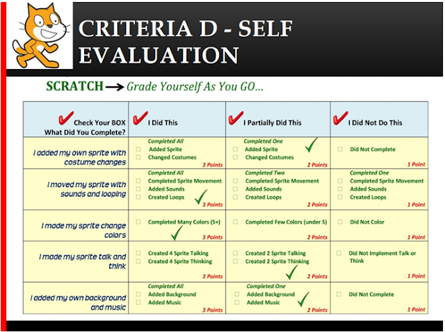
Here is my Self-Evaluation:


Judging from this evaluation, I did as mentioned before (I did really good). I has scored 12/15 I feel like my scratch is good, but can be made better. But hey, it's only my 2nd Scratch, and practice makes perfect! Let's see what my partners have to say about my Scratch!


Peer-Evaluation:

There are 2 peer evaluations done for me; Armaan and Adam Houssami.

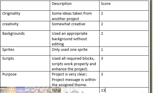
Evaluator: Adam Houssami: 


Evaluator Armaan:


Reflection:

Adam Houssami had given me a  13/18! I am ecstatic with my mark, but I still know that there is room for improvement, because my 1's and 2's could boost up, and I could possibly improve my whole mark out of 18. Since I have gotten 13/18, I am ecstatic but I am a bit disappointed and appalled because I did bad. TO be honest, I rushed in a bit and only spent 2 hours in total on my scratch. Furthermore, Armaan had given me a 13/18 as well! I am happy with that and I think that was an honest mark on my work. I feel like since I got 13/18 for both peer evaluations, I deserve to stay on it. Overall, I think that I did good when it came to my  scripting (programming blocks), as well as changing my backgrounds. However, what I can improve is my creativity (as in my ideas), and the message of my project. 

Question:  Not to rebel or anything, but I don't get why it says I copied some ideas. I DID NOT copy anything, as I am the only one in the class to do this topic; Illiteracy and the Lack of Proper Education for Everyone. Furthermore, I do not understand why I got a 2/3 for that when I copied NO Ideas? 

Conclusion:

Overall, I learnt a lot this whole term. I learnt things from the Tech Fair, all the way down to Scratch Programming! It has been a blast (pun intended)! I have advanced so much in a period of only a month, and it has been so wonderful! I cannot believe it! Boy, it shows what I'm capable of (not to be bias...). From the the Teach Fair, I have learnt skills and well as information and some physics. I learnt multiple skills like collaborating, building and communicating effectively. From physics, I learnt velocity, speed and even balanced forces (when our model had to to wheels spinning at different Newtons so that it would move). However, when it comes to Scratch, I think it it is pretty obvious. I learnt how to program. In the beginning, I found programming extremely hard, and I didn't understand a thing! On the other hand now I understand it with ease, and I can do things like changing backgrounds, changing sprites' costume, and even making advanced gravitational balls! So, to wrap this up, I would like to say that this Term has been Awesome as well as a great journey, and I hope there are many terms like this to come!  

Monday, March 21, 2016

Motherboard MS Publisher Flyer:

Motherboard MS Publisher Flyer:


Technology and the National Agenda:


National Agenda and our Te
ch Fair Project:


How my Tech Fair project is related to the 

UAE National Agenda?


These are the 6 pillars:
  • Cohesive Society And Preserved Identity.
  • Safe Public And Fair Judiciary. 
  • Competitive Knowledge Economy.
  • First-Rate Education System.
  • World-Class Healthcare.
  • Sustainable Environment And Infrastructure.

Well, my project made with Azaan, using Lego will and does relate First-Rate Education System. This is because Lego is used for children, to aspire,create,imagine, and build. That is exactly what we have done. We have created,imagined,aspired, and imagined, whilst creating the model. This made us think about the 2021 vision, and then we did this blog post. This project relates to the "First-Rate Education System", as it expands the imagination, and creativity that is deep in children, and lets it all out. This creates social confidence as well. As well as this relates to First-Rate Education System, our project also relates to Sustainable Environment And Infrastructure. This is because our model is a prototype, powered by "wiring circuits". This doesn't require any energy, and it's safe to the environment, and not causing any air pollution.Well, in the future, possibly in 2021, NOT saying this will happen, but using out prototype, the UAE government can implement our model and make it into a bigger scale, and make it work too, whilst keeping it 'Eco-friendly'. Well, this relates a little bit. Anyways, I hope the National Agenda "dream" comes true in the next 5 years. 


Well, this was brief, but I hope you enjoyed it, Thank You!

Here is my blog link to my Tech Fair Blog:

http://yahyatechfair2016.blogspot.ae

Monday, November 2, 2015

Project- World of Advertisements

Design Situation:

Inquiry And Analysis:

Statement Of Inquiry: 

  • Advertisements as a form of communication have evolved through time and space to influence audience's perspective.
 Introduction:


Hello, my name is Yahya Wasim and I am a student of technology in my Digital Design class. I have lived here (country not going to be specified for safety reasons) for almost all of my life. I come from Pakistan and I have a keen interest in computers and technology. Speaking of computers and technology, I like my Digital Design class as we learn how to do new things that we haven't learnt before. It is also really interesting because this class also teaches me how to apply new skills and helps me with my work. 

My chosen Advertisement Type:


My passion is car designing. So, as part of the Digital Design MYP Project, I have decided to do a Flyer about advertising my own Formula 1 car. My target audience are my friends and other normal people who aren't aware of this big event/my car. My Flyer is based on an annual International Formula 1 school competition.  I have chosen to do a flyer advertisement because I find for me that using a flyer is one of the best ways to express an advertisement to everyone else. I have also chosen to do a Flyer based on an annual International Formula 1 school competition/my car because I'm pretty sure that not many people know a lot about or not even know anything about it. Doing a flyer also has many advantages such as it is a small cost of money for a good printing- quality flyer and other things. Not only do I think that  using a flyer is one of the best ways to express an advertisement (in my opinion), but I also think creating an advertisement in the form of a flyer will be really helpful and handy because in that way you can use your creativity to contrast with the specific product that you are marketing/selling (promoting). I can use my creativity and colors (my strengths) in order to gain more of my target audience. However, the only drawback of a flyer is that it will be very time consuming for my in order to create a perfect advertisement. Just saying, I think I can handle the heat of the time consuming, as I am determined to complete my work always on time. In conclusion, I would like to say that I will choose to use a commercial advertisement for my Digital Design because of the affect it will have on MY target audience (my friends and other normal people who aren't aware of this big event/my car) and because of how this vital thing will help in order to increase my Digital Design Class marks for my criteria/criterion. 

Why I Chose To Do A Flyer About F1 In Schools:

I chose to do a flyer about F1 (Formula 1) in schools (my car) to advertise as a flyer because I want to advertise my car for the big annual F1 competition. I want to advertise my car because it is vital for my car to have publicity in this big and and crucial annual car designing competition and also because I can spread some publicity to my car, as it will be judged and marked by the judges. Another reason for why I also want to advertise my car is because I want to draw more people into seeing my car and coming to Yas Marina Circuit in Abu Dhabi (where the competition will take place). I strongly think that I should create this advertisement because it will help get my target audience to come to Yas Marina Circuit and also see my car, as well as probably get to see it race. This means that I will advertise my car in the way of a flyer in order show great my car design is compared to other cars, as well as the performance. Speaking about target audiences, I believe that my flyer that I will create about F1 in schools/ my car designing would be useful to adult visitors/ tourists coming to Abu Dhabi and Dubai. I also believe that this flyer that I will create will also be useful for people who like cars and are into designing and creating/crafting things.In conclusion, I think that creating an ad (a flyer) about F1 in schools/my car designing is a really good idea as it can help me to spread the word about my car that I am creating, as well as help attract tourists and other people to come and see my car in Yas Marina Circuit in Abu Dhabi. (This event will take place next year in May).

RFERENCES:
  • http://www.kraftwork-chelmsford.com/f1-in-schools.pdf
  • http://www.yasmarinacircuit.com/en/formula-1/f1-in-schools

  
My Explanation to My Target Audience:

Dear Fellow Friends,Tourists,Car Enthusiasts,

I have chosen you as my target audience because I know that you (tourists) will be keen to go to such a wonderful annual competition and would love to see my car design(s) that I have created. However, my other target audience (my friends) will love to see my car and tell me how it looks and suggest new ideas for improve-ment. Lastly, my final target audience (car enthusiasts) will enjoy to see my new car designs as well as you (car enthusiasts) will seek some new future car designs as well as tips and inspiration. For my F1 project that I am advertising (my car) , I have intended/chosen to make a flyer because of its ease and because of the eye-catching colors that can be used. Another reason why I intend to make a flyer is because my designs/ advertisements in my opinion can then be expressed easily for me. However, after doing the flyer, I am also intending to make an ad video. In DTP, my strengths are: creativity, technological experience and also good designing skills. These skills will help me in order to create my Flyer. However my skills for ad creating are: good video editing software skill, good programming system skill, good creativity and good originality for an idea.  For creating my flyer, I am probably going to use MSP (Microsoft Publisher) and for the video ad I'm probably going to use Windows Movie Maker or iMovie. My highlight of the video on my flyer and on my video ad will be my designed car so that you can see it. Making the flyer will probably take about 1-2 hours for 1 copy of the flyer because of the perfection and detail I will need to put as well as to adjust my car design from another car designing program and uploading it to MSP to create my flyer with it. However, later during the term, when we have to make the video ad, making the video ad might take me a couple of hours to perfect, with properly editing it and perfecting the lighting of it and the angle of the project whilst also perfecting the other vital things needed to create the best/crucial ad.

My U.A.E National Day Flyer:


My U.A.E National Day Flyer Reflection:

Making this flyer ( my U.A.E National Day Flyer) for Digital Design class, I found it very exciting and intriguing, as I love making flyers. I also found it very fun for a warm up for the actual thing I was going to make. I have learnt some new skills like "eye-catching designing" as well as another skill called: "innovating designing". However, during this lesson, I also learnt some new things like: using some of the vocabulary in the Digital Design like: Colour Chart, Character and also Contour. I have learnt this terminology using this website:

I have also learnt this (the terminology that I used) in order to properly add these in my work because I wanted to use some of these things that we have used before during our Digital Design class, In order  to create an outstanding, eye-catching flyer. In conclusion, I would like to say that I can now fully create an appropriate/proper flyer because of what I have learnt whilst making this flyer as a warm up. Creating this flyer is giving me a step closer of a proper idea of what I have to create for my actual flyer (my F1 flyer).  


My First Plain Draft For My Actual Flyer:


NOTE: This is just my first mini draft/layout. This will not be how the final flyer will look like.


My Design Specification:

This is going to be the draft of what I will actually produce (my advert that I will publish). However, this is nothing like the actual thing. My actual flyer will be a hype ad (an advertisement that includes special offers and entices the audience in that way).It will be a hype ad because hype ads are what I'm trying to aim for (the type of advert). My actual flyer will be much better when I make it on MSP (Microsoft Publisher). It will be a I will use size 16 black color Britanic Bold" for my writing and info. However, for my bold words and slogan, I will use size 22 red color (bold and underlined) "Times New Roman". I will use a portrait basic template in order to design and create my actual Flyer about F1 (my car). I will also hand-draw my car and some of the thing/pictures. In conclusion, I would like to say that this is one of the first actual things that I can use my strengths - creativity and colors. I hope that my Flyer turns out the way I want it to - not the opposite way.


My Actual Flyer:


My Actual Flyer Reflection:

Making this flyer was very fun and intriguing. I was able to properly and successfully create my flyer. I was surprised how this flyer turned out to be AMAZING. I used some really bold colors and I think that those colors were also vibrant and helped catch the eye a lot. I used some vibrant yellow to catch the eye. I also used white for some of my writing because I didn't want to make this advertisement/flyer seem very busy with lots going on in the background. I used red for my title because I knew that the title was big so I had to make it attractive and to get more attention if someone were to look at my flyer. In conclusion, I would like to say that this was a very new task for me, as I have just started designing flyer only in this activity. Doing this activity taught me lots of new skills and techniques. For example: I learnt a lot of eye-catching techniques from doing this flyer activity. I also found making this flyer an EXTREMELY fun activity. I am looking forward to do something exactly like this or something similar to this in the coming future.  

Image References: 

  • http://blog.industrysoftware.automation.siemens.com/blog/2011/09/16/f1-schools-championship-features-solid-edge-designed-cars/
  • http://www.johnlund.com/Landscapes.asp 


My Peer Tick Sheet For My Blog: 


My Peer Tick Sheet For My Blog Reflection:

Overall, I was pretty happy with what my peer gave me (my marks) based on my blog. I also like how everything that he marked was marked properly and precisely; not in a rush and improper. Perso-nally, I think I had some room for some improvement in my blog and that's where I think my peer could have been honest and told me what I could have improved. However, I am pretty impressed in terms of my blog because of how  organised and a good background it has. In conclusion, I would like to say that I found my blog pretty good (personally) but I always know that there is ALWAYS room for improvement. I enjoyed other people marking my blog and I hope for someone to judge and assess it again in the near future.


My Design Idea Specification:

This is my Final Reflection for the term (Term #1). In this reflection I will be talking about this Image that I snipped from MS Word that I completed for the reflection table based on my advertisement. I filled in the table based on the advertisement that I made. I found this task very fun and a way to look back at what I have done and what I have learnt. Doing this task, I think that completing the table was what went well and also designing it in color. I found that I could improve in Making the table more eye-catching next time. In conclusion, I found this task a very good way to understand everything that I have learnt and also a good way to evaluate what I did during the WHOLE term. I will be looking forward to be doing this task at the end of Term 2.                             


Monday, October 5, 2015

The World Of Advertisements:


Factors To Be Considered Before Making An Advertisement: 


Advertisements are one of the most crucial things to grab the audience that you want. It is essential to create an advertisement that is really creative; it attracts more customers and their attention is then caught. The more creative an advertisement is, the better it is, as it will entice your target audience that you need to grab. Creating advertisements is an easy way for best-selling product companies, such as McDonald's, Apple, Toyota, KFC,e.t.c. to capture more of their target audience.

 Here are some key factors to create a successful ad:

  • Focus on a certain target audience to promote your product.
  • Your advert should be original and creative.
  • Your tone of voice should complement the product.For example: A food ad will not have your boring voice. Your voice needs to be full of expression and appetizing.(Only if it's a commercial).
  • Attract customers based on their needs.
  • Select the suitable media for your advertisement. It could be a TV commercial, brochure,flyer,e.t.c.
  • Use bold words.
  • Include exciting offers.
  • There are 3 important factors for content. They are:

  1. The way the product works.
  2. The role model preferring the product. Someone famous like Ronaldo, Messi, e.t.c. 
  3.  A spokesperson, a celebrity showing his linkage to this product.

    What is the importance of creating ads?

     These are some of the factors of why creating ads are important:


    1. Advertising is important for the customers.


    2. Advertisements play a very important role in the life of customers.


    3. It helps to promote, goods, services, ideas and events.


    4. It maximizes the Profit of the Advertiser.


    5. It educates society and others about the product, idea or service you are doing/promoting.


    6. It creates a good impression of the brand/company. 


    How do advertisements impact businesses and                                     society?


    These are some of the ways of how adverts impact business and society:

    1. Advertising can have a large impact on new businesses by helping businesses create an image/reputation of their business/company.

    2. Advertising impacts society negatively by making a negative impact on the social lives of people across the globe.

    3. Advertising also makes another cynical impact on society. It plays with the minds and emotions of the target customers, making them think that buying and consuming the product are the activities of life.


    Advertisement Analysis:

    Good Ad:


    This is a good example of a good advertisement  made by Popchips:


    Bad Ad:


    This is an example of a terrible advertisement made by McDonald's:


    My Findings/Conclusions on the Criteria:


    As you can see, the first advertisement has all the required tips to 
    having an outstanding, catchy advert that is most likely going to interest lots of their target audience.This advertisement made by Popchips was a very nice ad, as it had a good, bold heading and the spacing was well thought out, taking up lots of space while still being a great ad that is well spaced. Although this ad was excellent, the advertisement could have been a bit more creative and catchy with more bold colours to attract more people. The first thing people recognize are eye-catching colours and pictures. However, the second advertisement is not that good, showing that only one of the required tips are used. The spacing  of the advert wasn't very well thought, as the advert was only filled with a creative picture in the middle.The creativity of the animal in this ad was good, as many people also notice colourful pictures when seeing a poster.. Generally, this advert wasn't that good. I was pretty disappointed from McDonald's because I expected more from their ads, even though they have one of the best worldwide commercials.

    This is a sample video of a great advertisement by Nike:

    This video commercial is showing the product, without using words. However, this video sill catches interest, as it is very bold about the topic without really using any words.This Nike video is a great example because it also uses many of the needed factors for an eye-catching commercial, yet also a commercial that catches the target audience that Nike is trying to promote it's newest Mercurial shoe.


    In conclusion, I would like to say that advertisements are very crucial and they also impact society alot. It is key to remember in order to create a successful ad, you need to use features of good ads to promote your product. These factors will help strengthen your advertisement and will help you catch the audience that you want/need to catch. Remember, always follow these advertisement tips in order to create a successful ad , yet a creative ad. 

    REFERENCES:

    1.https://deepakagrawalblog.wordpress.com/2009/12/15/factors-need-to-be-considered-before-making-an-advertisement/
    2.https://blog.bufferapp.com/social-media-ads-strategies
    3.http://www.bayt.com/en/specialties/q/207820/what-factors-are-essential-in-making-a-good-advertisement/
    4.http://www.managementstudyguide.com/objectives-importance-of-advertising.htm
    5. http://kalyan-city.blogspot.ae/2013/01/importance-of-advertising-why.html.
    6.http://smallbusiness.chron.com/advertising-its-impact-business-3605.html
    7. My prior Knowledge.

    My Reflection:

    Generally, I found this task a very good task to do, even though it was a really long and exhausting task. I found this task very long because it took up lots of my time, effort and energy to make this blog post.However, even though I found this task a quite easy task, this task was pretty challenging to do because I had to find lots of information that would take up more than 750 words to achieve a good mark for my criteria in Digital Design class. Finding that information was not as easy as it sounds, because not every site had the required information that would be helpful to me for my "World of Advertisements" project. Although this project was also one of the hardest online blog tasks I had to do, (considering I have only done 3 blog tasks!) it was a blog in which I learnt multiple skills.For example, I learnt the importance of ads and its impact on society. I also learnt how to analyze two different ads using a criteria. In conclusion, I would like to say that I found this blog task very delightful and challenging as well. I hope we do more of the blog tasks in the upcoming future.


    Task 2: Associate an advert to each of the following:                                        


    1. What comes to your mind when you see this advertisement?
    2. What is unique about this advert?
    3. To what type of advert can you relate to?
    4. Why is it related to that and give your explanation?

    ASSOCIATION AD:

    1. What comes to my mind is the slogan saying "There Can Only Be One". This tells me that there can only be ONE NBA champion.
    2. It is a clever way of comparing to different people on to one face.
    3. An association ad.
    4. It is related to association ads because it is using two NBA starts to create on NBA champion.


    MUST-HAVE AD:

    1. What comes to my mind is that this bottle of Heinz Ketchup is shaped like a bottle of Heinz Ketchup.
    2. It is a smart way of showing a ketchup bottle shaped using tomatoes, as ketchup is made using tomatoes.
    3. A must-have ad. 
    4. This ad is related to Must-have ads because Must-have ads suggest that you must have this product to be happy, popular or satisfied. This is exactly what this Heinz ketchup advert is doing.


    GAMES AND ACTIVITIES AD:


    1. This ad makes me think that this tablet is trying to promote learning in a fun way .
    2. It is a good way of putting this ad to show that this tablet is good to help children for educational causes.
    3. A Games and Activities ad. 
    4. When you see this ad, you see it as an ad with fun activities (learning in a fun way).


    CALL TO ACTION AD:


    1. This ad makes me think that there is going to be/is a big sale at a hardware shop.
    2. It is a very clever way to attract more customers to do what they say.
    3. A Call to Action ad. 
    4. When you look at this ad, you see the sign saying "I WANT YOU TO VOTE!".


    REPETITION AD:

    1.     When I see this ad, I think of this ad promoting a discount for this sofa.
    2.     It is an extremely cunning way to attract more customers to buy more of this company's product because of the big sale.
    3.   A Repetition ad. 
    4.  When you look at this ad, you see the big sale sign saying "BIG SALE".


    SPECIAL INGREDIENTS AD:

    1. This ad makes me think that this ingredient (the chocolate) makes normal milk much better.
    2. The unique thing is that the words written next to the milk are helping to promote the chocolate.
    3. A Special Ingredients ad. 
    4. When you look at this ad, you see the bold words saying "A DELICIOUS TREAT".


    HYPE AD:


    1. This ad makes me think that there is a new amazing offer for a product.
    2. The unique thing about this ad is that it uses words like "SPECIAL" to make the ad seem more exciting.
    3. A Hype ad. 
    4. When you see this ad, you see the use of hype, (the use of the word SPECIAL).

    FEAR AD:


    1. This ad makes me think that you should use Listerine mouthwash for your breath.
    2. The special thing about this advert is that it uses humor with fear to get the message about using Listerine mouthwash.
    3. A Fear ad. 
    4. When you look at this ad, you see the use of fear, because you can see that the man is exerting bad breath from his mouth. So to fix this, Listerine is to be used.

    HUMOR AD:


    1. This ad makes me think that you should scratch to win. Not in the sense of scratching yourself but as in the sense of scratching a card to win something.
    2. The special thing about this advert is that it uses a good sense of humor while also getting to the main point.
    3. A Humor ad. 
    4. When you look at this ad, you see the use of humor, as the picture shows a boy scratching his rear side when they also actually mean scratch a card and win.

    CLAIM AD:

    1. What comes to my mind from this ad is that this remote control is labelled to help the customer learn how to use it.
    2. The special thing about this advert is that it is using a diagram to help explain the function of the product.
    3. A Claim ad. 
    4. When you look at this ad, you can see it is related to claim ads because it is using a diagram to help explain the function of the product. 
    SENSE APPEAL AD:


    1. From this ad, I think that this advert is trying to promote this McDonald's ad using sense appeal.
    2. The distinctive feature about this ad is that it uses sense appeal to attract its customers.  
    3. A Sense Appeal ad. 
    4. When you look at this ad, you see the use of sense appeal because this ad is using sight to attract customers. 


    TESTIMONIALS AND ENDORSE-MENTS  AD:

    1. This ad makes me think that Ronaldo is trying to promote the new Nike Mercurial shoes.
    2. The special thing about this advert is that it is 
    3. A Testimonials and Endorsements ad. 
    4. When you look at this ad, you can see the use of a celebrity who is well known world-wide in order to promote Nike's product.

    MY REFLECTION BASED ON THE ADVERTISEMENTS ACTIVITY:

    Generally, I found this task a quite easy task, although it was a task that was pretty challenging to do because I had to find lots of information that would fit each of these specific ad types in order to achieve a good mark for my criteria in Digital Design class. At the beginning of the task,  I was mostly unsure of what to do because I didn't want to do something that wouldn't turn up right. However, during the task, as I learnt what to do, I felt very confident because I learnt what I had to do then and I completed it (the task) with ease.The task was a really enjoyable and fun experience to do, even though it needed/ I put lots of effort into it. I mostly used my prior knowledge for doing this task but I also learnt some new information from some websites that I used for this task. During this task, I learnt new skills like comparing different ads while also giving my own opinion with it. I also learnt another new skill called: "Advertisement Analysis". To sum it up, I would like to say that I am looking forward in the future to do more of these tasks relating to this enjoyable task, as this task was a pleasure to do. :)

    MY MIND-MAP POSTER FOR ADVERTISING METHODS:


    MY REFLECTION BASED ON THIS MIND-MAP/POSTER:

    During in my time making this poster, I found this an extremely easy task to do, as the poster was somewhat not alot of work to do. However, even though this mind-map/poster that I made was not that big to do and didn't take lots of time, it was an extremely enjoyable A4 poster to make.While making the poster I was really confident, as I straight away knew what I had to do and completed this poster very easily. Making this poster also taught me some new advertisement techniques that would not only be handy for me, but even handy for YOU to use in the future. I also learnt some new poster creating techniques, like making a poster in the style of a mind-map. In conclusion I would like to say that this "Methods of Advertising" mind-map/ poster was an incredible, fun experience that taught me alot of new handy tips and even some new skills.I wold like to use more of my skills and techniques in any upcoming projects/posters. I am looking forward in the upcoming future to do more of these types of poster tasks, as then I can fully unleash my creativity into my posters even more.

           Task 3: Comparing Different Methods of                                        Advertising:  

    The Different Methods Of Advertising:
    1. Magazines
    2. Newspapers
    3. Radio
    4. Television
    5. Internet
    6. Out of Home
    7. Direct to Home


    The Advantages and Disadvantages of Each of the Following:

    Magazines:
    Advantage: The bright colours attract more magazine readers.
    Disadvantage: Some content might not be appropriate for small children. 
    Target Audience: Mostly Adults and Some Kid Magazines.

    Newspapers:
    Advantage: A good place to advertise, as you can select to advertise on the whole page.
    Disadvantage: Lots of information might leave little are for advertising.
    Target Audience: Mostly Adults and some teenagers.

    Radio:
    Advantage: Easy place to advertise a really good ad.
    Disadvantage: Disrupts you when you are listening to a song.
    Target Audience: Teenagers (Mostly) and Adults.

    Television:
    Advantage: A good place to show an enticing commercial.
    Disadvantage: Might disrupt you when watching 
    Target Audience: All ages.

    Out of Home:
    Advantage: Different places of advertising, so a bigger chance of seeing lots of ads to entice customers.
    Disadvantage: Some ads might not be that easy to see.                    
    Target Audience: From kids to adults.

    Direct To Home:
    Advantage: The best chance of a customer to see your product.
    Disadvantage: Too many ads might not attract the customer and can make them lose interest in the offers. 
    Target Audience: From kids to adults.

    Internet:
    Advantage: Many famous and well-used websites to advertise on.
    Disadvantage: Advertising on really good websites will hurt your wallet (it will be too costly).
    Target Audience: From kids to adults.

             Digital Design Table Task Checklist:


    MY GROUP WORK TASK:


    MY REFLECTION:

    During this post, I worked with Christopher in order to make a group task in which we had to write 2 definitions of 2 words that we we given. We used a plain landscape template on Microsoft Publisher in order to create our work that we had to do in a pair. It was a really enjoyable and fun task to do, as I also learnt new skills like creating a table and also filling in a page background. I also found this a fun task because it was a good task that helped to make my contribution skills even better. In conclusion, I would like to say that this task was very fun and intriguing to do and taught me some critical words used in Digital Design class terminology, as well as the ways they are used and for what it's used and how to use it. 

    Don't forget to comment any feedback/constructive criticism!